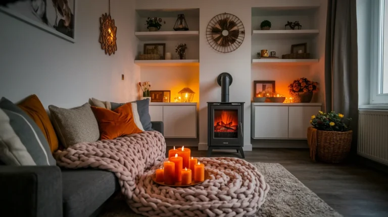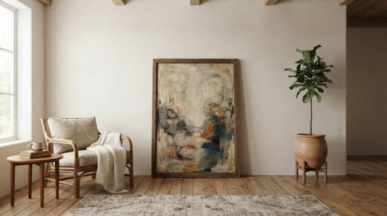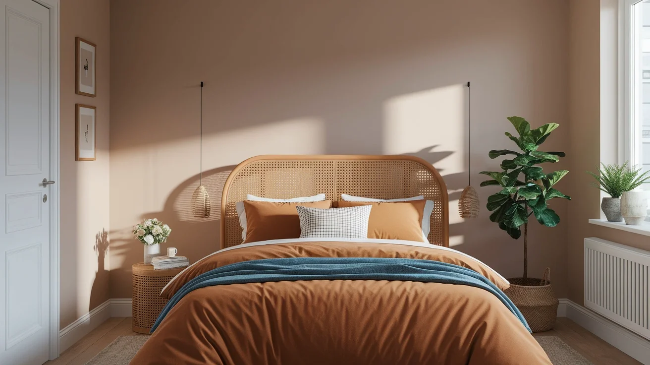
Staring at a beige living room in late September rarely feels like enough once the air turns cool. Fall home decor colors solve that exact problem using rich reds, warm terracottas, and grounding neutrals instead of one flat paint swap. Testing color combinations across three different living rooms taught real lessons about which shades actually pair well together. A weekend and around $60 genuinely covers new pillows, a throw, and one candle set. That’s why this guide skips vague color advice and names twenty-eight specific shades pulled from real autumn palettes. Whether the goal involves paint, textiles, or small accents, these colors build a genuinely warm home without a full renovation.
Deep Burgundy
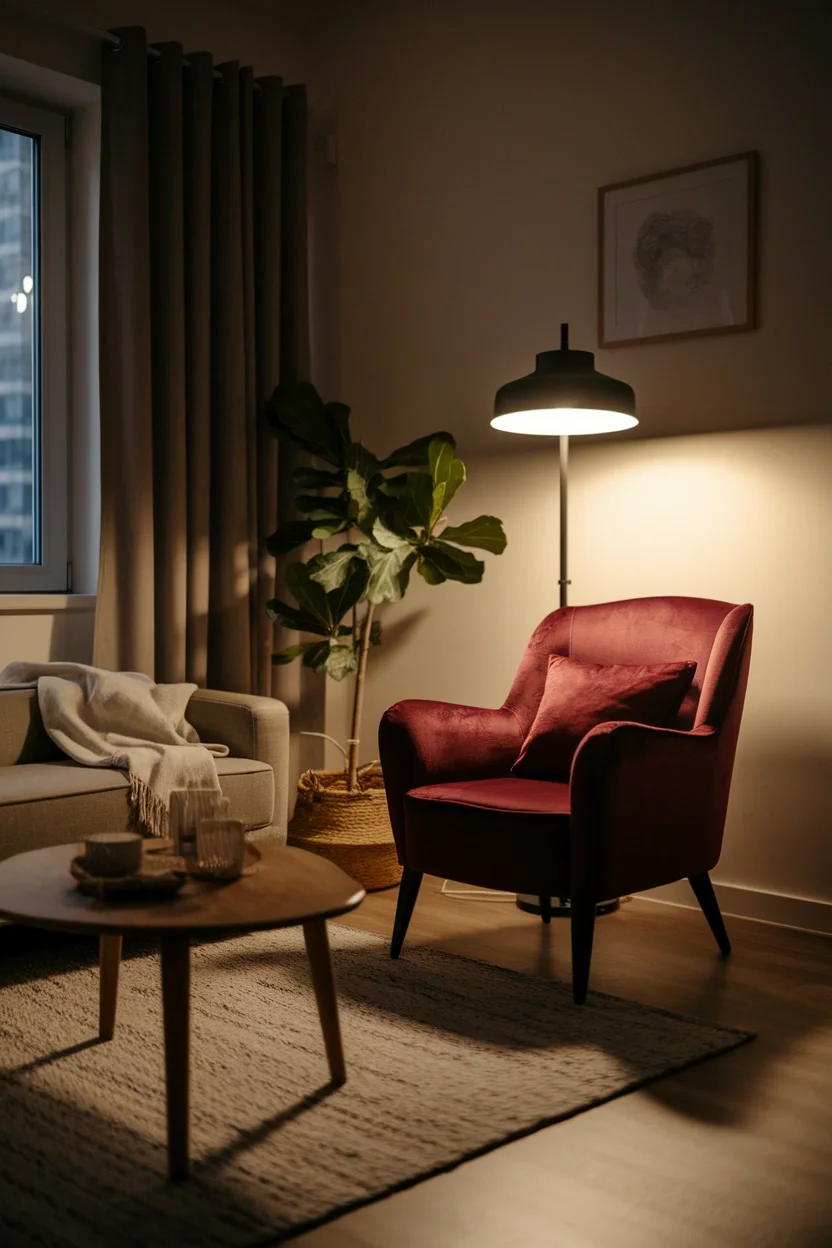
Deep burgundy is a rich wine-red shade that brings genuine warmth without feeling overwhelming. This color works beautifully as pillows, a throw, or one accent chair. Living rooms gain instant depth against neutral walls.
- Wine-red tone feels rich warm
- Works as pillows or throws
- Pairs with cream and camel
- Suits living rooms and bedrooms
Small doses of burgundy genuinely create drama without repainting an entire room. This shade works through textiles, candles, or one statement chair alike. It suits renters and anyone wanting moody warmth affordably.
Spiced Wine
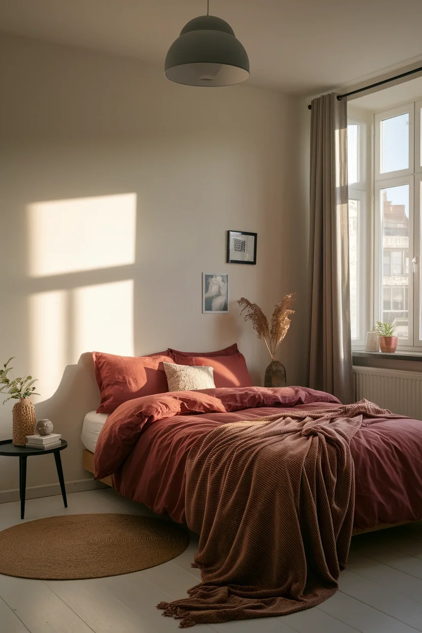
Spiced wine sits between burgundy and brown, carrying a genuinely warm, muted depth. This tone feels sophisticated on bedding, curtains, or one accent wall. Bedrooms gain a cozy, enveloping richness instantly this season.
- Sits between burgundy and brown
- Feels sophisticated and muted
- Works on bedding and curtains
- Suits bedrooms and reading nooks
Muted tones genuinely age better than bright, saturated color choices over several seasons. This spiced wine shade works through textiles that update easily each year. It suits cozy bedrooms and quiet reading corners.
Rich Cranberry
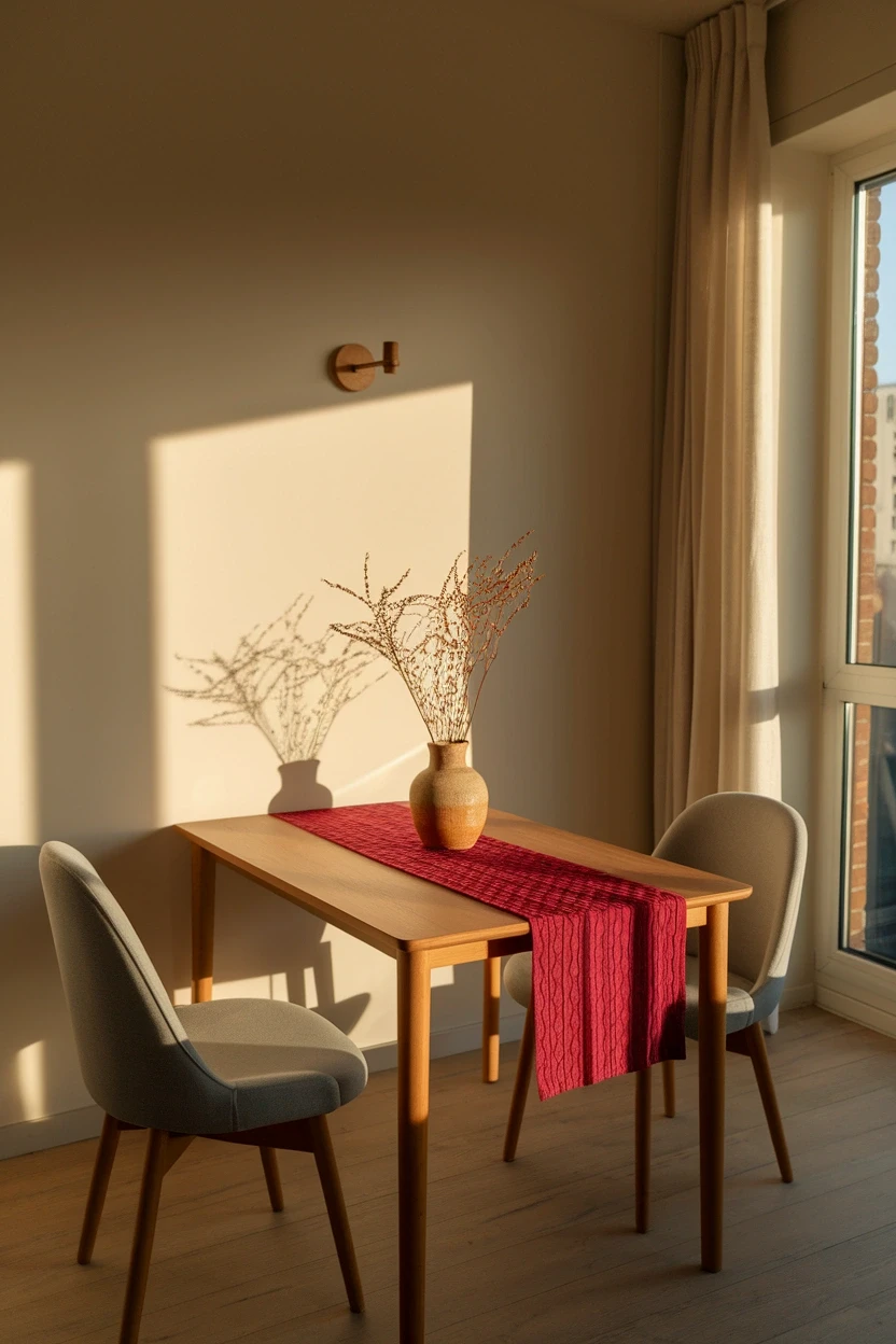
Rich cranberry brings genuine vibrancy that softer burgundy tones sometimes lack entirely. This shade works beautifully on table runners, vases, or small dining accents. Small dining nooks gain real personality through one bold color.
- Brings genuine vibrant energy
- Works on runners and vases
- Pairs with cream and gold
- Suits dining rooms and kitchens
Vibrant accents genuinely wake up a neutral dining space without any major renovation needed. This cranberry shade works through small, swappable pieces each season. It suits dining rooms and kitchens craving seasonal color.
Moody Plum
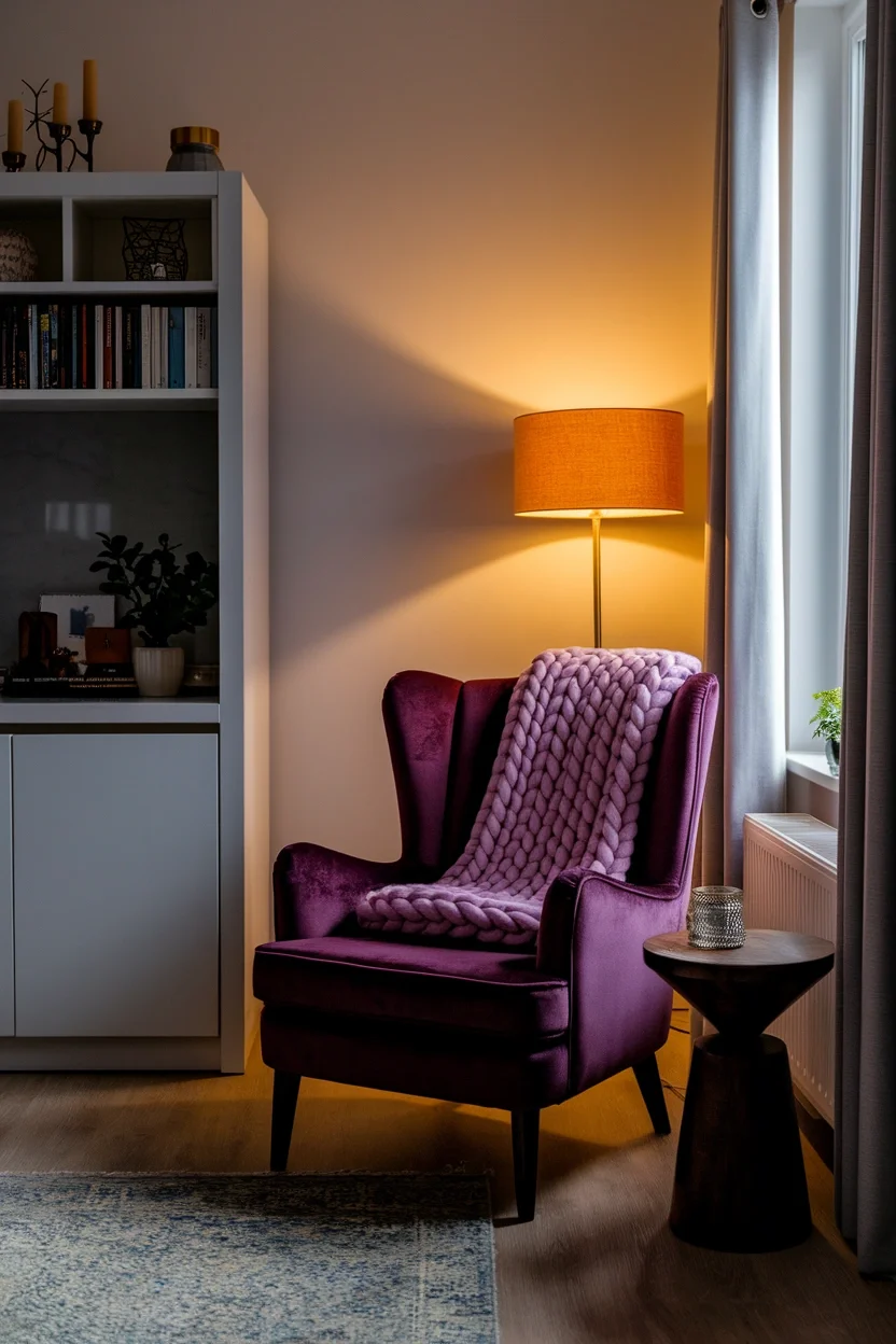
Moody plum leans darker and cooler than burgundy, carrying genuine drama and depth. This purple-toned shade works beautifully on one accent chair or velvet pillow. Reading corners gain real atmosphere through this single color.
- Leans darker cooler than burgundy
- Works on chairs and pillows
- Pairs with amber lighting well
- Suits reading corners and bedrooms
Dark, dramatic tones genuinely photograph beautifully under warm, low evening lighting conditions. This plum shade works for dark academia and moody aesthetic lovers alike. It suits bedrooms and quiet corners craving depth.
Muted Claret
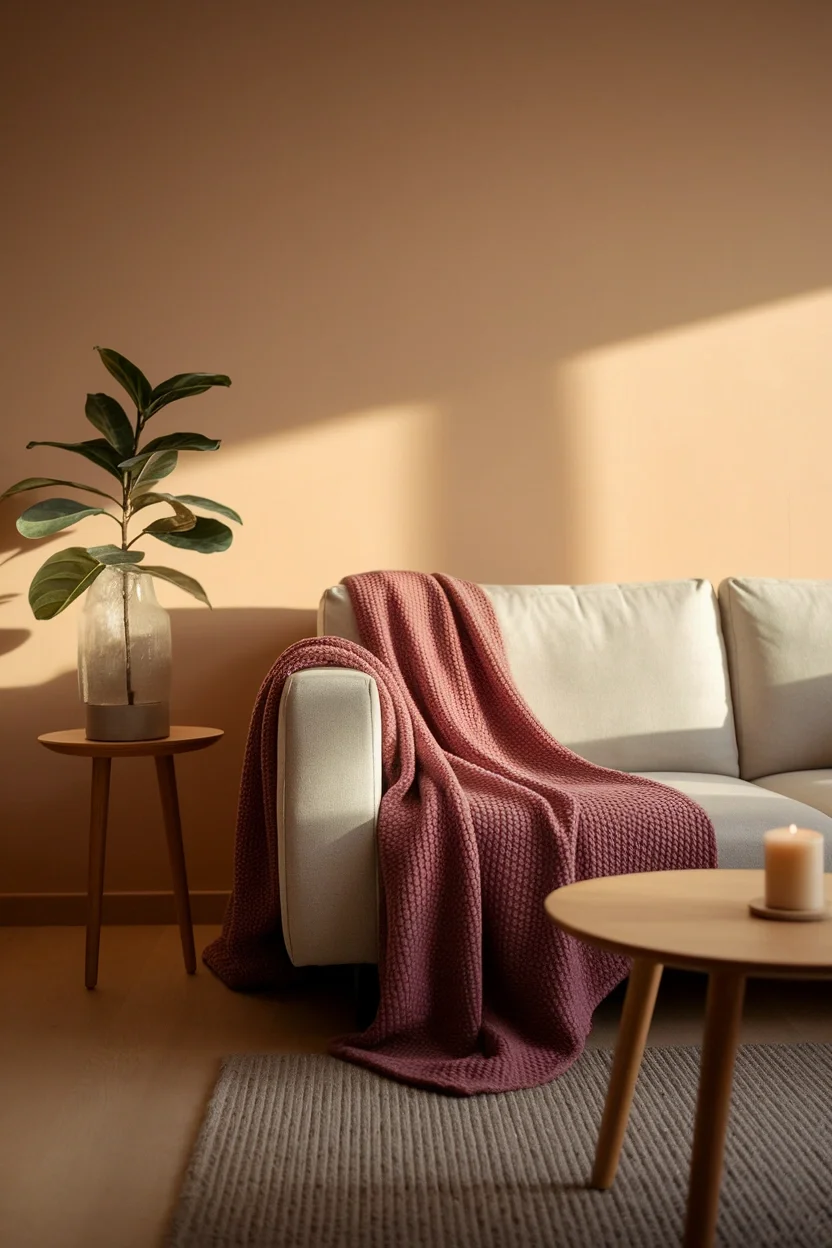
Muted claret softens rich red-wine tones into something genuinely gentle and wearable daily. This dusty shade works beautifully as a throw blanket or subtle wall accent. Living rooms gain warmth without any harsh contrast.
- Softens red-wine into gentle tone
- Works as throws and accents
- Feels wearable in daily rooms
- Suits living rooms and hallways
Gentle, muted colors genuinely suit renters who want warmth without any bold commitment. This claret shade works through soft textiles that layer easily together. It suits small living rooms and shared apartment spaces.
Burnt Sienna
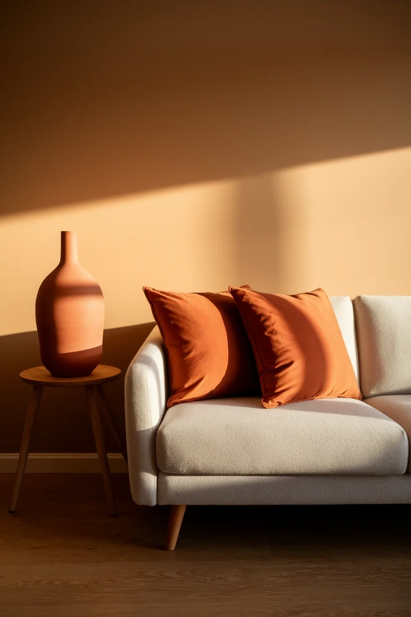
Burnt sienna is a warm, earthy reddish-brown that instantly signals autumn without feeling costume-like. This shade works beautifully on pillows, pottery, or one accent wall. Living rooms gain genuine warmth through this grounded tone.
- Reddish-brown feels genuinely autumnal
- Works on pillows and pottery
- Pairs with cream and wood
- Suits living rooms and entryways
Earthy tones genuinely ground a room the same way natural wood or stone would. This sienna shade works through textiles, ceramics, and small accent pieces. It suits living rooms and entryways wanting real seasonal warmth.
Warm Rust
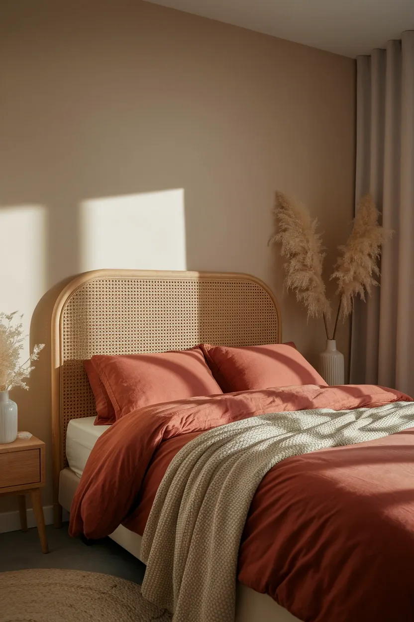
Warm rust brings genuine autumn energy without leaning too orange or too brown entirely. This shade works beautifully on bedding, curtains, or one accent wall nearby. Bedrooms gain instant coziness through this balanced tone.
- Balances orange and brown tones
- Works on bedding and curtains
- Pairs with rattan and wood
- Suits bedrooms and living rooms
Balanced tones genuinely mix easier than colors leaning too far toward one extreme. This rust shade works through bedding that refreshes an entire bedroom instantly. It suits bedrooms and living rooms craving warmth.
Terracotta Clay
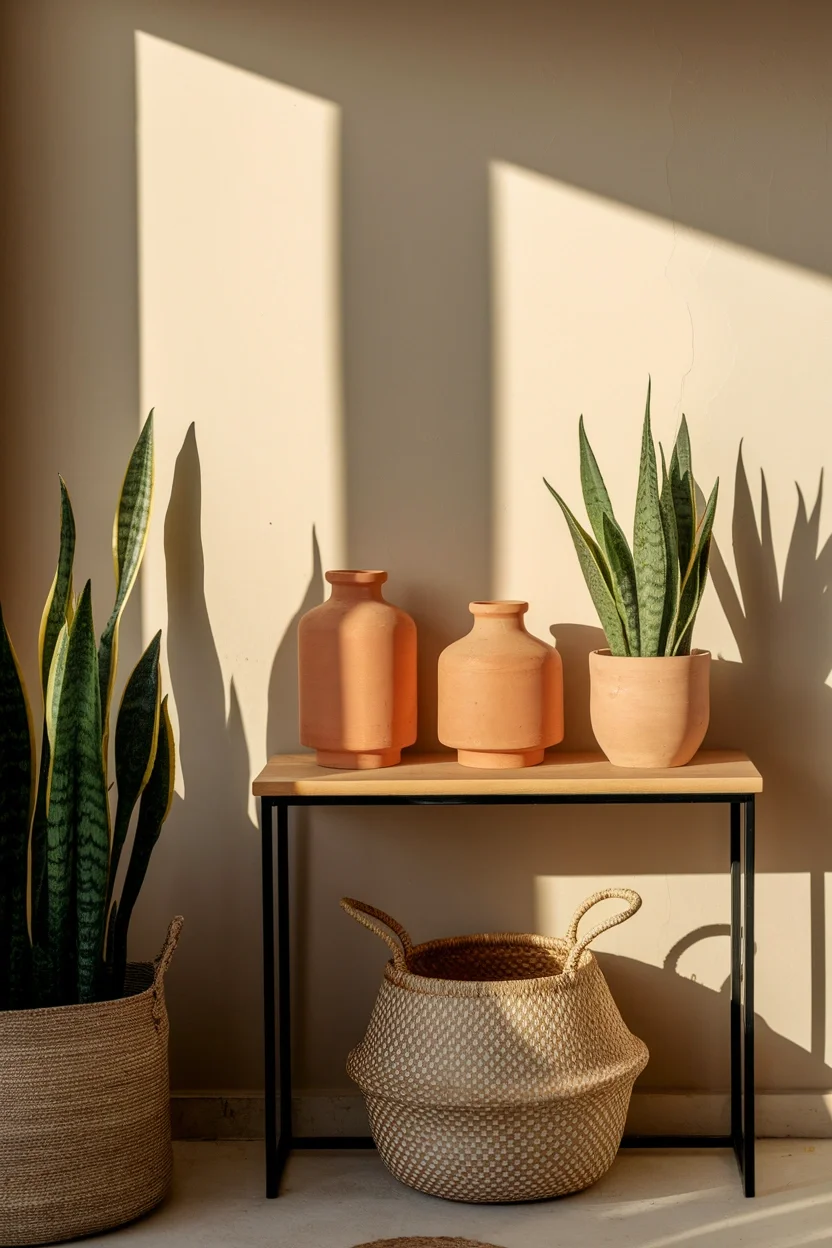
Terracotta clay carries a genuine sun-baked warmth that ceramic pots have used for centuries. This shade works beautifully on planters, vases, or small entryway accents. Small apartments gain earthy character through this timeless tone.
- Sun-baked tone feels timeless
- Works on planters and vases
- Pairs with woven natural textures
- Suits entryways and small apartments
Timeless colors genuinely outlast passing trends within any well-planned home palette. This terracotta shade works through pottery that mixes into countless room styles. It suits entryways and small apartments building lasting warmth.
Toasted Cinnamon
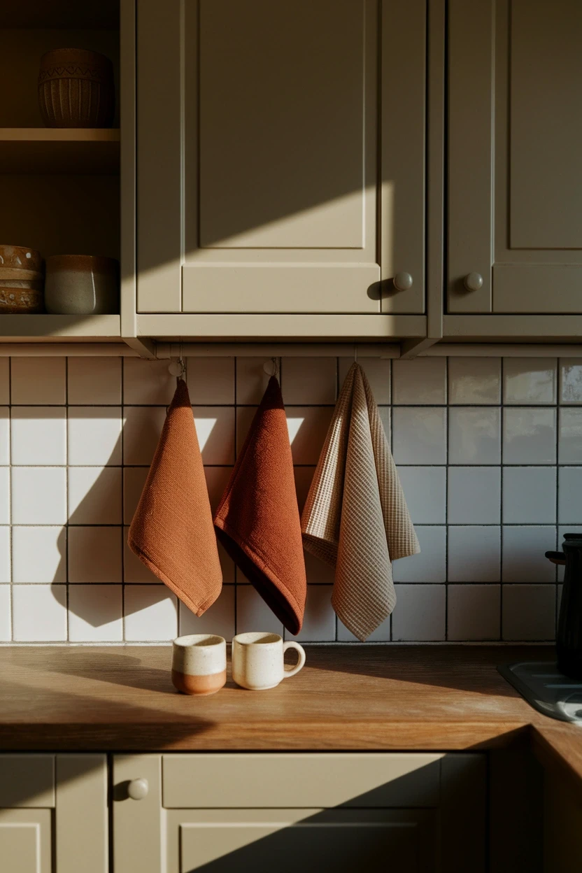
Toasted cinnamon is a warm, spiced brown that feels genuinely inviting in kitchens especially. This shade works beautifully on dish towels, mugs, or small kitchen accents nearby. Small kitchens gain warmth through everyday styled objects.
- Spiced brown feels genuinely inviting
- Works on towels and mugs
- Pairs with cream stoneware nicely
- Suits kitchens and dining nooks
Kitchen colors genuinely matter since cooking happens there daily throughout the whole season. This cinnamon shade works through swappable textiles that refresh quickly and cheaply. It suits kitchens and dining nooks craving warmth.
Muted Pumpkin Spice
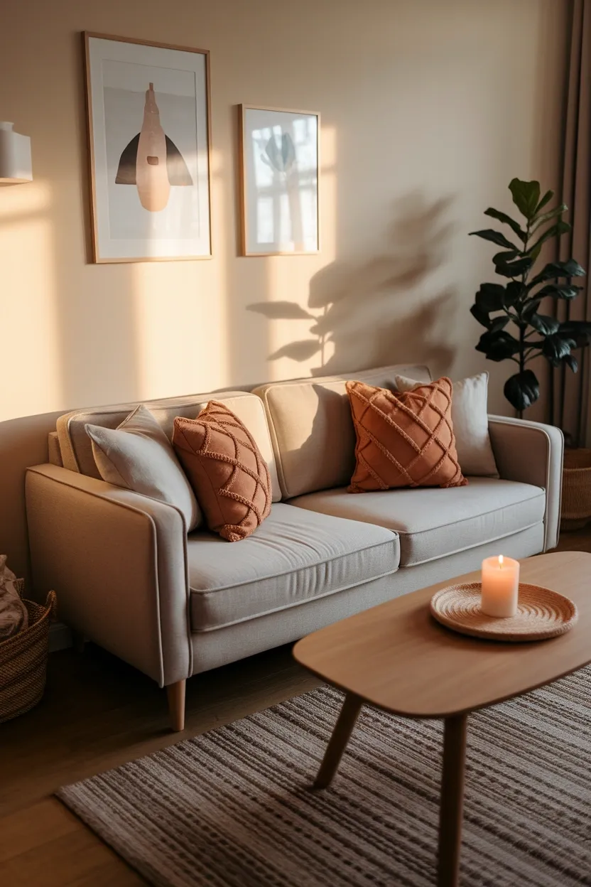
Muted pumpkin spice softens bright orange into something genuinely wearable inside real homes. This dusty tone works beautifully on pillows, throws, or small autumn accents. Living rooms gain seasonal warmth without feeling overly literal.
- Softens orange into wearable tone
- Works on pillows and throws
- Feels seasonal without being literal
- Suits living rooms and bedrooms
Softened seasonal colors genuinely work year-round better than bright, literal pumpkin orange. This muted shade works through textiles that transition past October easily. It suits living rooms wanting subtle, lasting autumn warmth.
Amber Orange
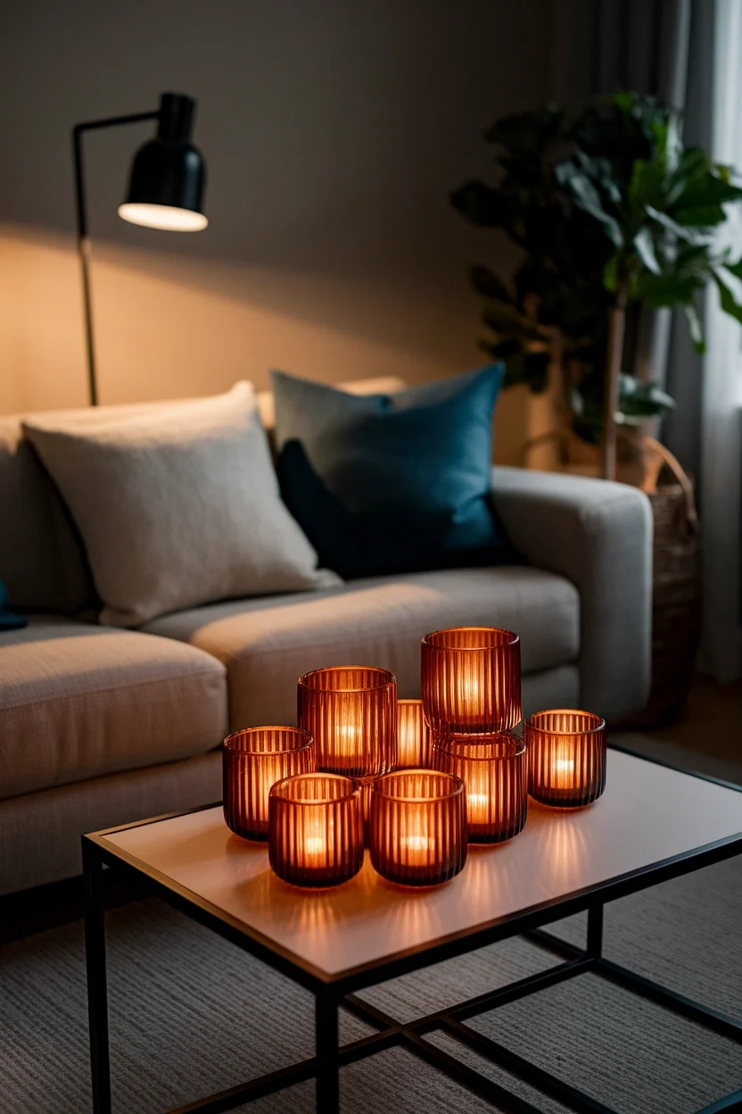
Amber orange glows warmly through glass, making it a genuine favorite for candle holders and vases. This translucent shade catches evening light beautifully across any surface. Living rooms feel instantly warmer once lit.
- Glows warmly through glass
- Works on candles and vases
- Catches evening light beautifully
- Suits living rooms and bedrooms
Glass color genuinely behaves differently than fabric, glowing rather than simply sitting flat. This amber shade works through candle holders that change after dark. It suits living rooms and bedrooms wanting warm ambiance.
Mustard Yellow
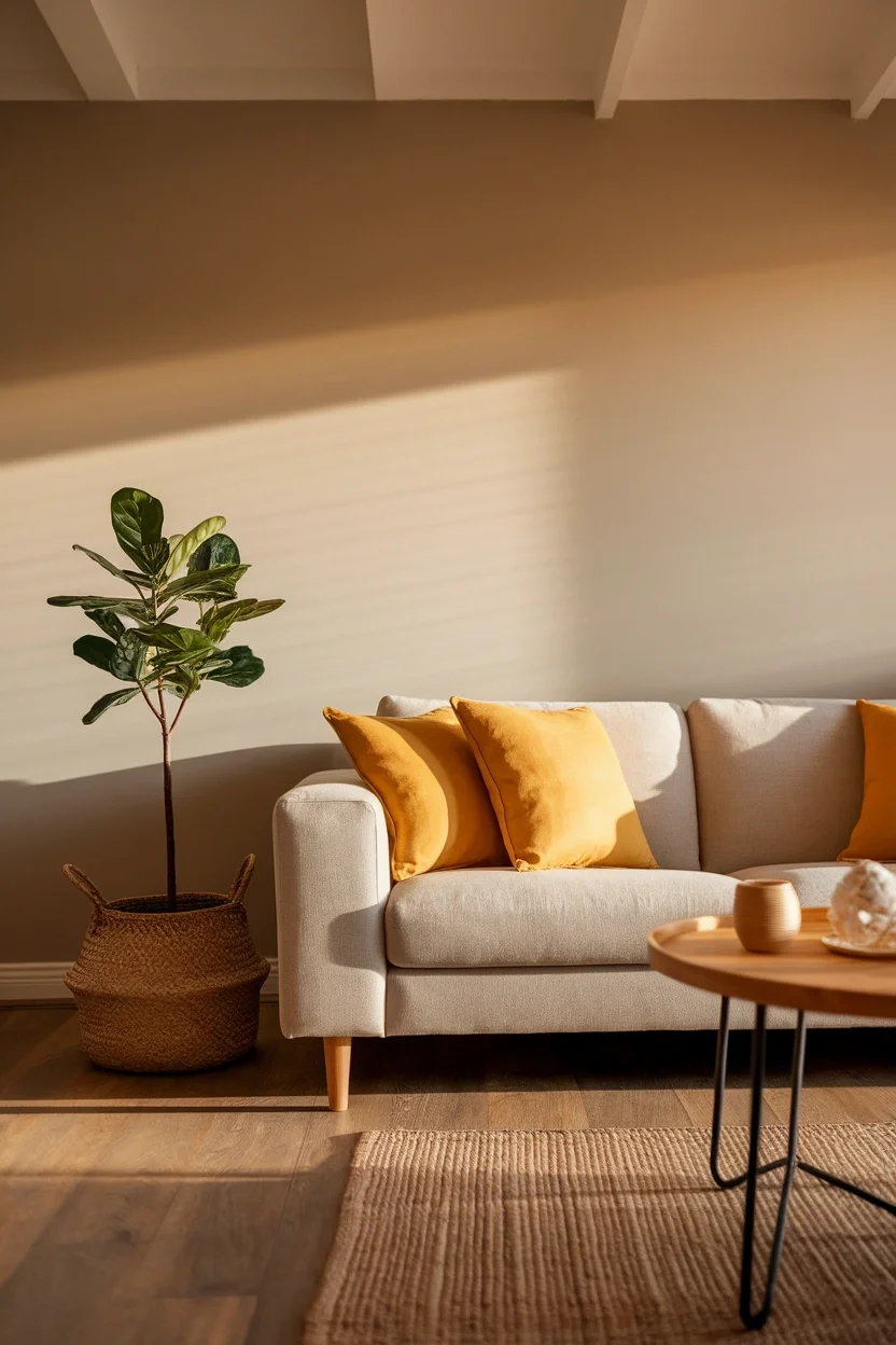
Mustard yellow brings genuine boldness that softer neutrals sometimes lack entirely in a room. This shade works beautifully on pillows, one accent chair, or small vases nearby. Small living rooms gain real personality instantly.
- Brings genuine bold personality
- Works on pillows and chairs
- Pairs with navy and cream
- Suits living rooms and offices
Bold accent colors genuinely energize rooms that otherwise stay entirely neutral and quiet. This mustard shade works through pillows that swap easily between seasons. It suits living rooms and offices wanting real personality.
Honeyed Gold
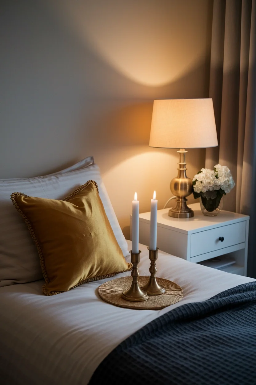
Honeyed gold carries genuine warmth and subtle shine that flat yellow tones cannot match. This shade works beautifully on silk pillows, candle holders, or small metallic accents. Bedrooms gain quiet glamour through this rich tone.
- Carries warmth and subtle shine
- Works on silk and metallics
- Pairs beautifully with brass
- Suits bedrooms and living rooms
Subtle shine genuinely upgrades a color beyond what flat, matte yellow alone achieves. This honeyed gold shade works through small accents that catch evening light. It suits bedrooms and living rooms wanting quiet glamour.
Warm Ochre
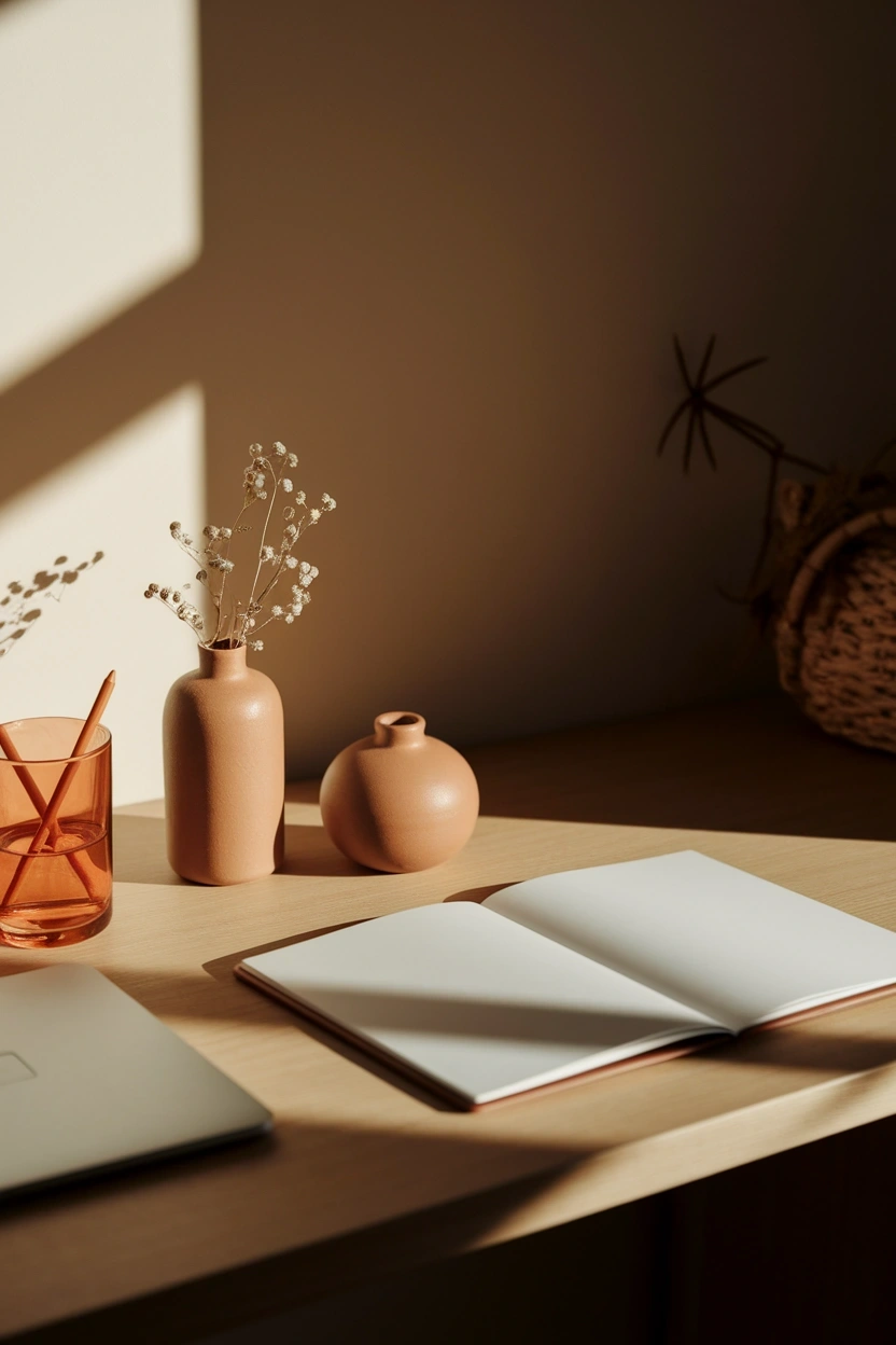
Warm ochre is a deep, earthy yellow that feels genuinely grounded rather than bright or garish. This shade works beautifully on desk accessories, vases, or small office accents. Home offices gain warmth without any distraction.
- Deep yellow feels grounded
- Works on desk accessories
- Avoids feeling bright distracting
- Suits home offices and studies
Grounded colors genuinely support focus better than bright, energetic shades in workspaces. This ochre tone works through small accents that stay professional yet warm. It suits home offices and studies wanting calm energy.
Warm Butterscotch
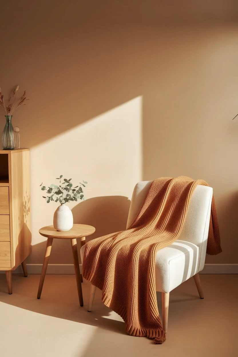
Butterscotch is a soft, warm caramel-gold that feels genuinely sweet without turning saccharine. This shade works beautifully on knit throws, cushions, or small autumn accents. Living rooms gain gentle warmth through this cozy tone.
- Soft caramel-gold feels sweet
- Works on throws and cushions
- Pairs with cream and rust
- Suits living rooms and bedrooms
Soft, sweet tones genuinely appeal to anyone building a hygge-inspired cozy home. This butterscotch shade works through knitwear that layers beautifully together. It suits living rooms and bedrooms craving gentle, warm color.
Muted Saffron
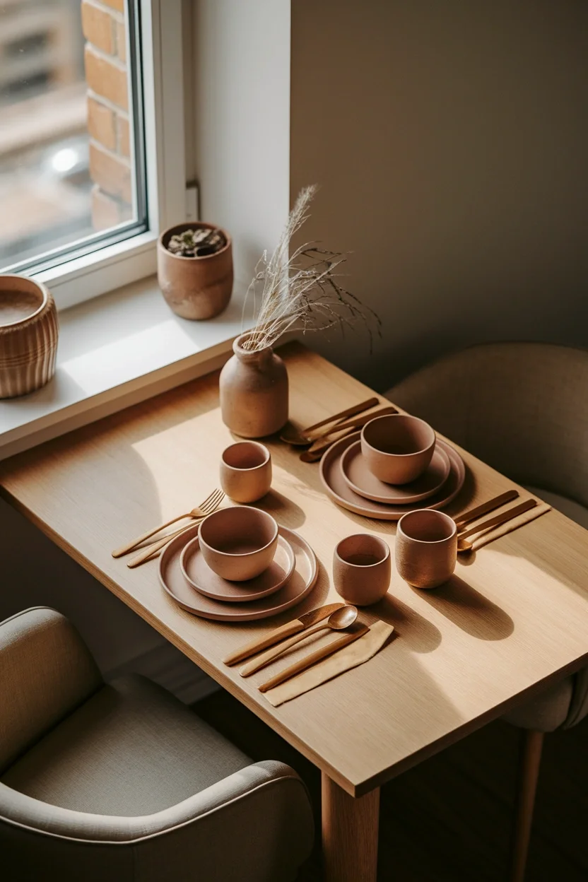
Muted saffron softens bright spice-market yellow into something genuinely livable at home. This dusty tone works beautifully on table linens, dinnerware, or small dining accents. Small dining nooks gain warmth without feeling overpowering.
- Softens bright yellow gently
- Works on linens and dinnerware
- Avoids feeling overpowering bold
- Suits dining rooms and kitchens
Dusty, muted spice tones genuinely work better in daily rooms than saturated versions. This saffron shade works through linens that wash and reuse easily. It suits dining rooms and kitchens wanting warm color.
Chocolate Brown
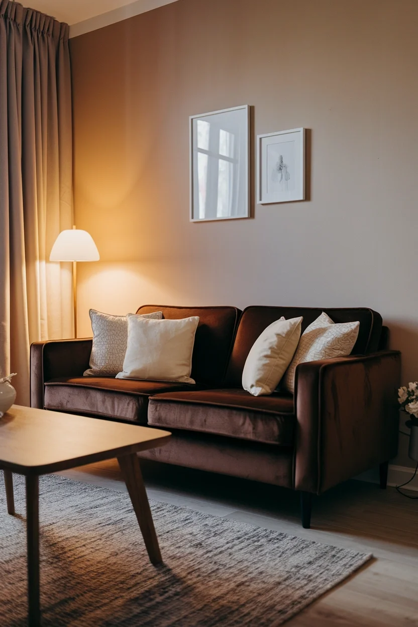
Chocolate brown is a deep, grounding neutral that quietly returned to popular home palettes. This shade works beautifully on sofas, large furniture, or accent walls nearby. Living rooms gain genuine richness through this timeless color.
- Deep neutral feels genuinely grounding
- Works on sofas and large pieces
- Pairs with cream and gold
- Suits living rooms and bedrooms
Grounding neutrals genuinely anchor a room the way black once did in decor. This chocolate shade works through large furniture that lasts many years. It suits living rooms and bedrooms wanting timeless, rich warmth.
Espresso Brown
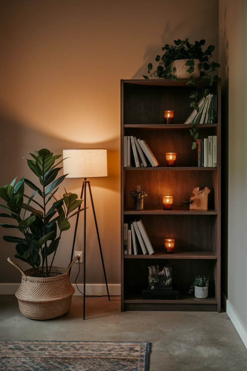
Espresso brown is a near-black wood tone that feels genuinely dramatic and refined. This shade works beautifully on bookshelves, furniture, or dark academia styling nearby. Home offices gain moody depth through this rich tone.
- Near-black tone feels dramatic
- Works on wood furniture pieces
- Suits dark academia aesthetics
- Suits offices and reading corners
Dark wood tones genuinely photograph beautifully under warm, low lamp lighting conditions. This espresso shade works through furniture already common in most homes. It suits home offices and reading corners wanting real depth.
Warm Caramel
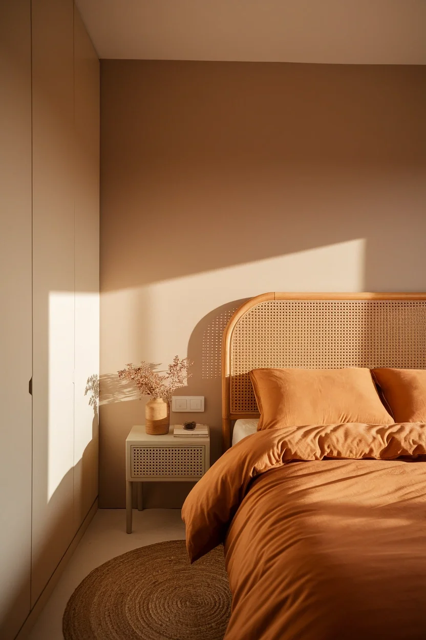
Warm caramel sits between beige and brown, carrying genuine coziness without feeling heavy. This shade works beautifully on bedding, throws, or small furniture accents nearby. Bedrooms gain warmth that still feels light and airy.
- Sits between beige and brown
- Feels cozy without heaviness
- Works on bedding and throws
- Suits bedrooms and small apartments
Light, warm neutrals genuinely suit small apartments needing coziness without visual heaviness. This caramel shade works through bedding that transitions across every season easily. It suits bedrooms and small apartments wanting balance.
Camel Tone
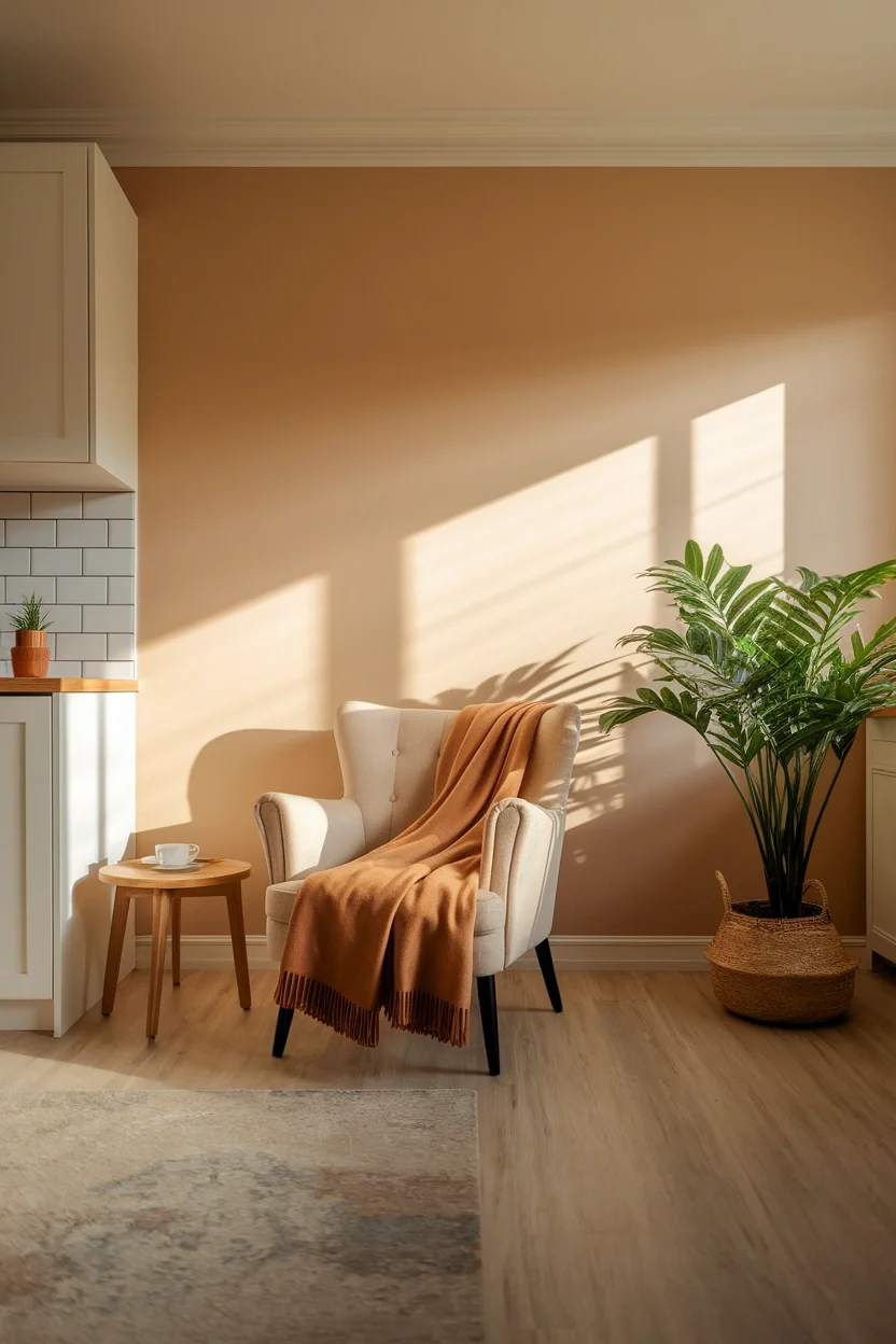
Camel tone is a warm, muted beige-brown that feels genuinely timeless across every room style. This shade works beautifully on throws, chairs, or large furniture pieces nearby. Living rooms gain warmth without ever feeling dated.
- Warm beige-brown feels timeless
- Works on throws and chairs
- Never feels dated or trendy
- Suits living rooms and bedrooms
Timeless neutrals genuinely outlast passing color trends within any thoughtfully built home. This camel shade works through furniture and textiles bought to last years. It suits living rooms and bedrooms wanting lasting warmth.
Oat Milk Neutral
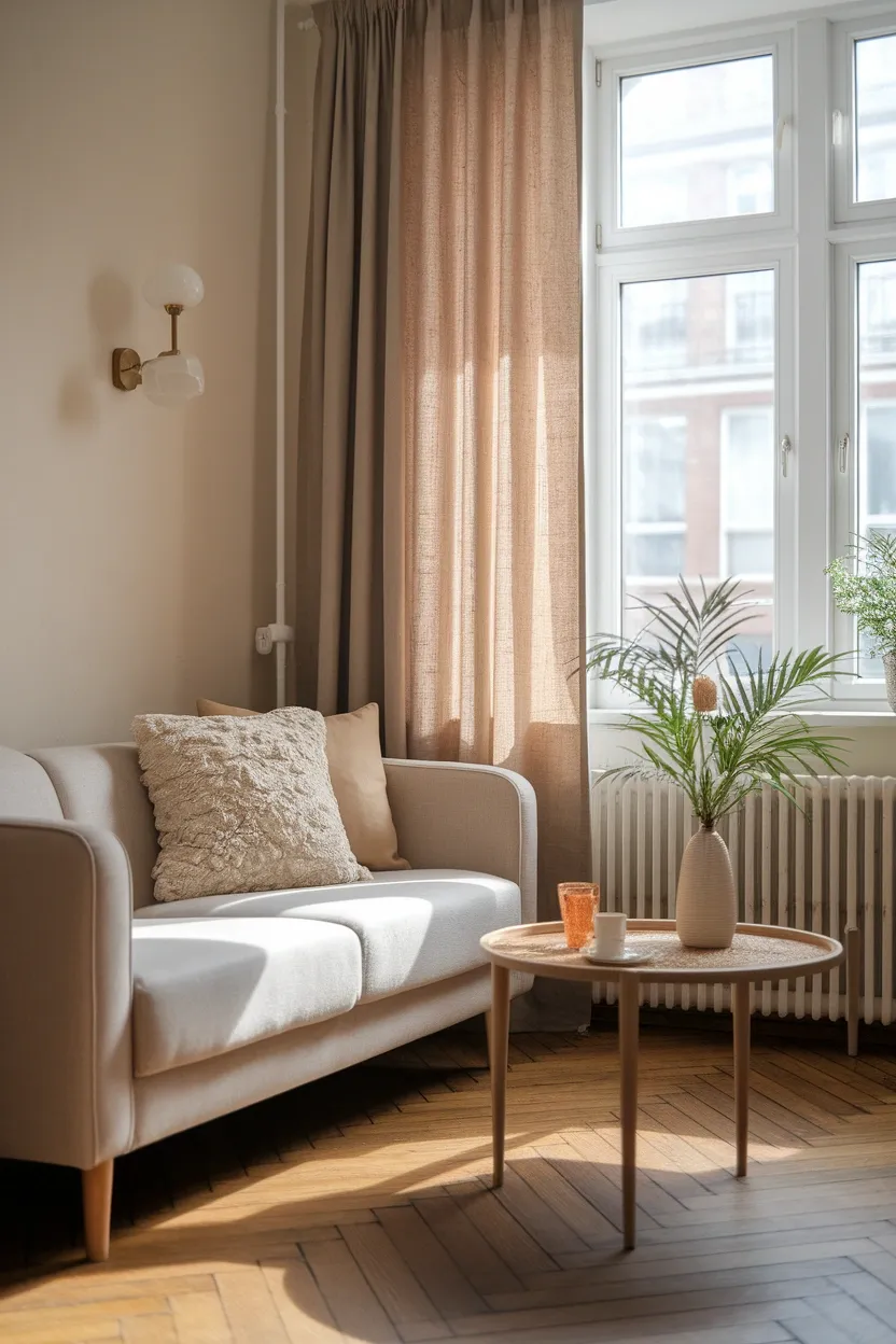
Oat milk neutral is a soft, creamy beige that feels genuinely calm and airy indoors. This shade works beautifully on curtains, linens, or large upholstered furniture. Small living rooms feel larger through this light tone.
- Creamy beige feels calm airy
- Works on curtains and linens
- Makes small rooms feel larger
- Suits small apartments and studios
Light neutrals genuinely make tight spaces feel more open and less cramped visually. This oat milk shade works through large pieces that anchor a whole room. It suits small apartments and studios wanting airiness.
Forest Green
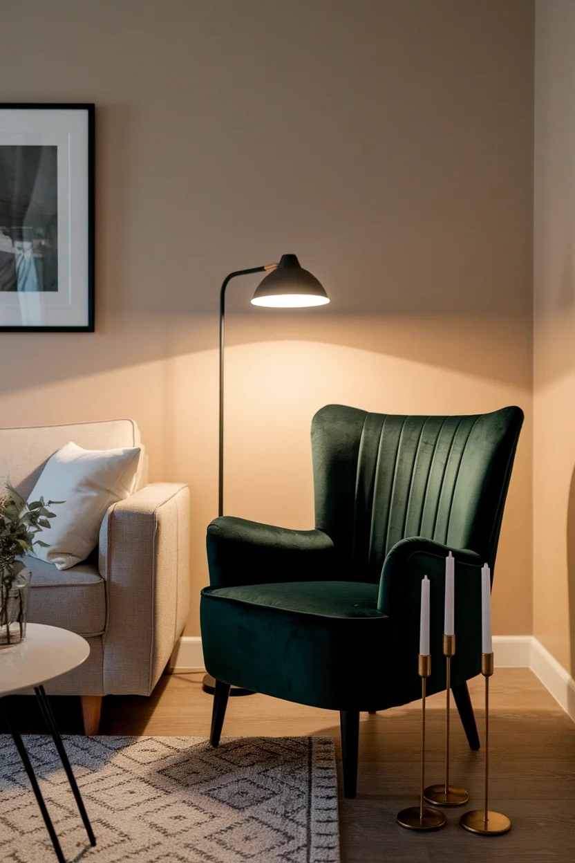
Forest green brings genuine richness that pairs surprisingly well with warm autumn tones nearby. This shade works beautifully on velvet chairs, pillows, or one accent wall. Living rooms gain real depth through this grounding color.
- Pairs surprisingly well with autumn
- Works on velvet chairs and pillows
- Pairs with brass and rust
- Suits living rooms and offices
Green genuinely balances warm reds and oranges the way nature pairs them outdoors. This forest shade works through velvet pieces that photograph beautifully year-round. It suits living rooms and offices wanting rich depth.
Olive Green
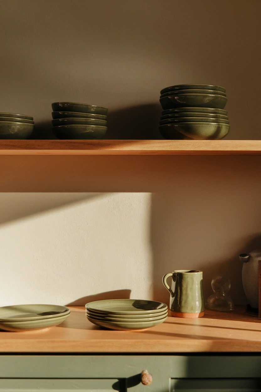
Olive green carries genuine earthiness that feels grounded rather than bright or seasonal only. This shade works beautifully on dinnerware, textiles, or small kitchen accents nearby. Small kitchens gain warmth through this muted tone.
- Earthy tone feels grounded
- Works on dinnerware and textiles
- Reads year-round not just fall
- Suits kitchens and dining rooms
Year-round colors genuinely offer better value than shades limited to one single season. This olive shade works through dinnerware that stays relevant every month. It suits kitchens and dining rooms wanting lasting color.
Muted Sage
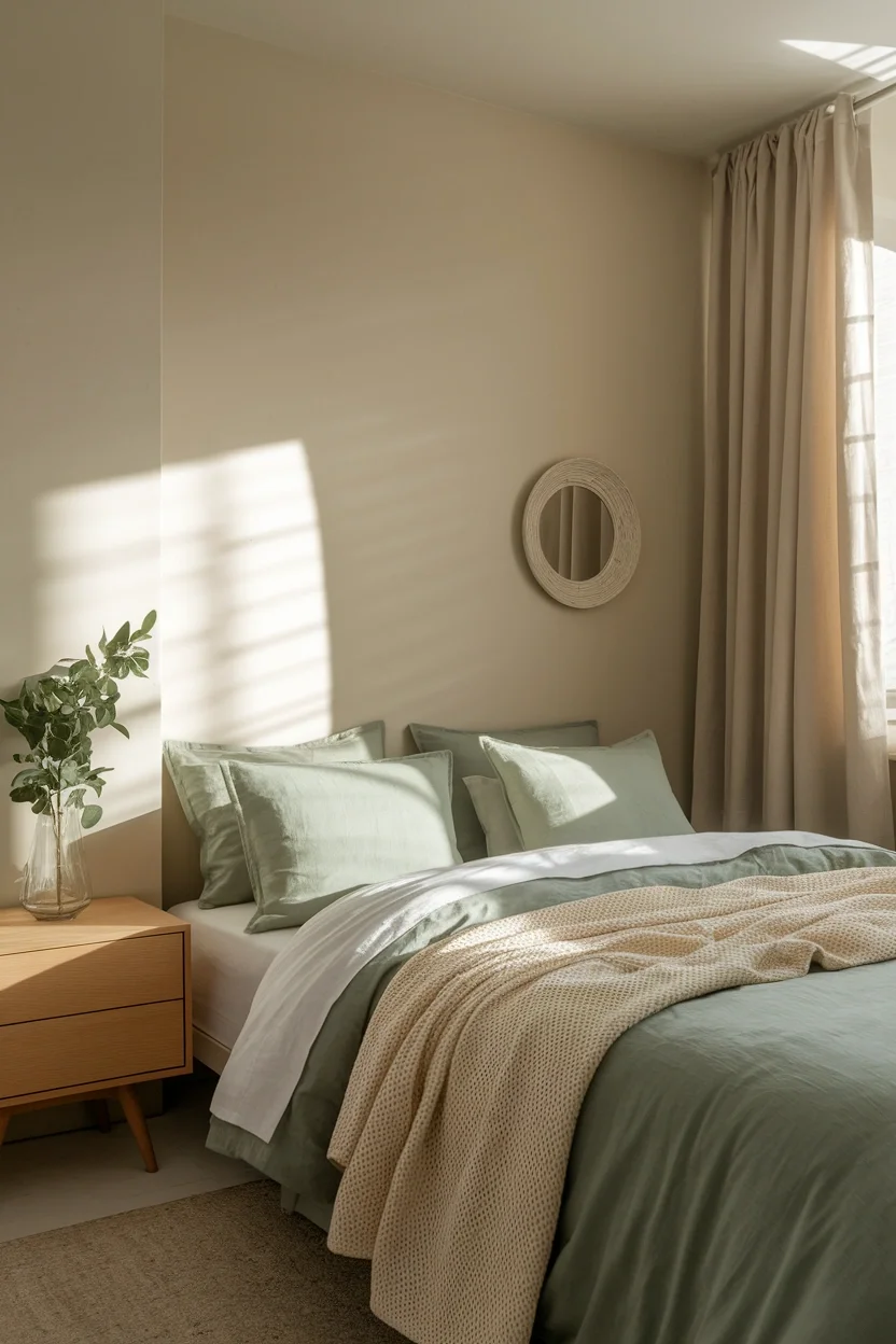
Muted sage softens forest green into something genuinely gentle and calming for bedrooms. This dusty tone works beautifully on bedding, curtains, or small plant accents nearby. Bedrooms gain quiet warmth through this soft, natural color.
- Softens forest green gently
- Works on bedding and curtains
- Feels calming and natural
- Suits bedrooms and nurseries
Calming colors genuinely support better rest in spaces meant for sleep and quiet. This sage shade works through bedding that feels fresh across every season. It suits bedrooms and nurseries wanting gentle, natural warmth.
Copper Accent
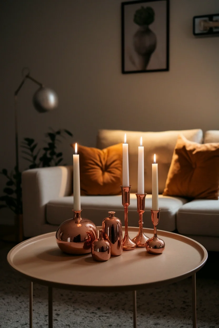
Copper brings genuine metallic warmth that gold sometimes lacks in richness and depth. This shade works beautifully on candle holders, vases, or small decorative accents nearby. Living rooms gain warm shine through this reflective tone.
- Metallic warmth feels rich deep
- Works on candles and vases
- Catches light beautifully indoors
- Suits living rooms and kitchens
Metallic accents genuinely add shine that flat, matte colors cannot achieve alone. This copper shade works through small pieces that catch both candlelight and daylight. It suits living rooms and kitchens wanting warm shine.
Brick Red
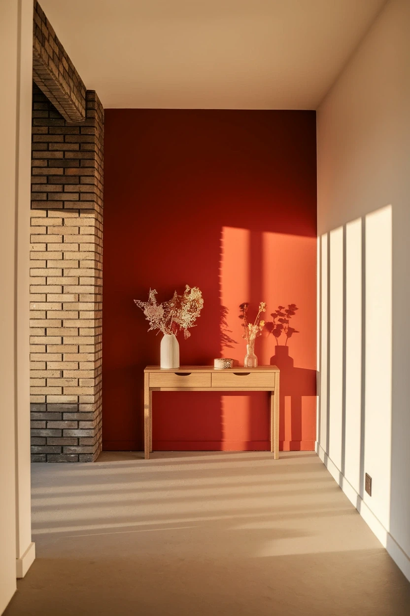
Brick red carries genuine warmth and history, echoing exposed brick walls in older homes. This shade works beautifully as one accent wall or bold entryway statement. Small apartments gain real character through this grounded red.
- Echoes classic exposed brick walls
- Works as bold accent walls
- Adds real character instantly
- Suits entryways and small apartments
Bold accent walls genuinely change a room more dramatically than smaller decor swaps. This brick red shade works especially well in entryways guests see first. It suits small apartments wanting real, lasting character.
Warm Gray Neutral
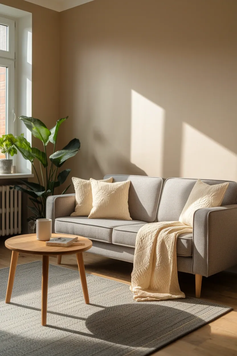
Warm gray avoids the cold, clinical feel that cooler gray undertones sometimes create indoors. This shade works beautifully on sofas, walls, or large furniture pieces nearby. Living rooms gain calm neutrality without feeling sterile.
- Avoids cold clinical undertones
- Works on sofas and walls
- Feels calm without sterility
- Suits living rooms and offices
Warm undertones genuinely matter more than the color name itself when choosing neutrals. This gray shade works through large furniture meant to last many years. It suits living rooms and offices wanting cozy neutrality.
Cognac Leather Tone
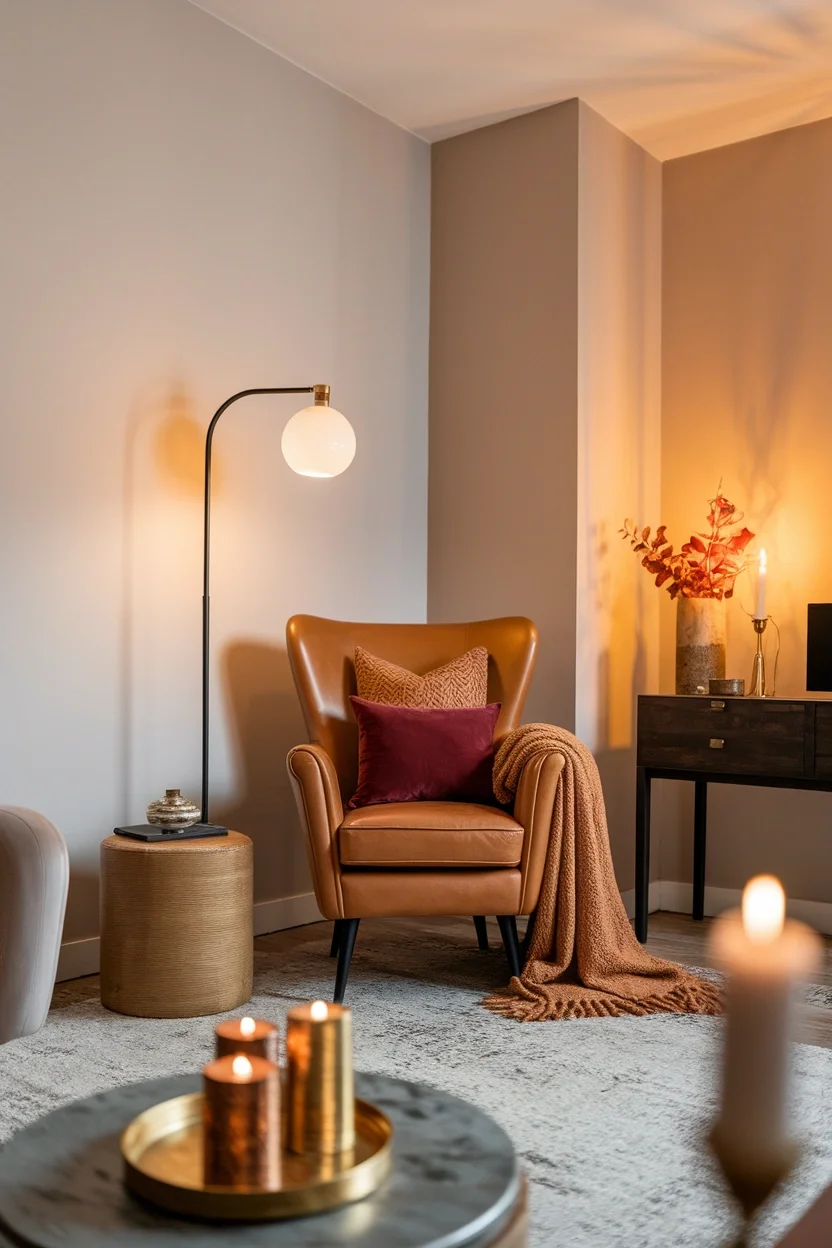
This final shade combines cognac leather with camel, burgundy, and brass into one room. Every color family from this guide appears here, proving rich fall tones layer together beautifully. The effect feels genuinely cohesive.
- Combines every fall color family
- Feels genuinely warm cohesive
- Works within nearly any budget
- Suits the entire fall season
A genuinely cohesive palette comes from layering colors rather than choosing just one shade. This cognac finale proves combining warm tones creates real seasonal richness. It suits renters, small spaces, and the whole autumn season.
Conclusion
Building a genuinely cozy home comes down to choosing the right colors, not buying more decor. These fall home decor colors prove that burgundy, rust, and sage work together beautifully across nearly any room style. Watching one new throw pillow completely change a plain, neutral sofa remains one of the most satisfying styling wins possible. Save this guide to Pinterest for your next color refresh. Try one shade this weekend using pieces already on hand. Share it with a friend still stuck on an all-beige palette. Your warmest autumn home starts with one thoughtful color choice.
Frequently Asked Questions
What colors work best for a cozy fall living room?
Burgundy, rust, chocolate brown, and warm caramel all create genuine autumn coziness. These tones pair beautifully with cream and camel neutrals already common in most homes.
How do I add fall colors without repainting my whole apartment?
Swap throw pillows, a blanket, and candles instead of painting walls. These small textile changes bring real seasonal color without any renter restrictions or costs.
Which fall colors work well together in one room?
Terracotta, cream, and forest green create balanced contrast without clashing. Sticking to three main tones keeps a room cohesive instead of visually busy.
Are dark fall colors too heavy for a small apartment?
No, small doses of dark colors like espresso or plum work well as accents. Pairing dark tones with light neutrals keeps a small room from feeling closed in.
What is the difference between rust and terracotta?
Rust leans more orange and saturated, while terracotta reads more muted and clay-like. Both work well together, though terracotta often feels calmer in daily living spaces.
How much does it cost to refresh a room with fall colors?
A basic refresh with pillows, a throw, and candles costs between forty and eighty dollars. Adding an accent wall or new furniture raises the budget significantly higher.
Do warm autumn color palettes work year-round or just in fall?
Many shades like olive green, camel, and chocolate brown work well all year. Brighter tones like pumpkin spice feel more seasonal and often get swapped after autumn ends.